Re-working Assignment Five

Additional work based on tutor feedback.

The tutor mentioned that probably there would be one more image to emerge that consolidates my approach and ideas. I created an image below that feels like an honest and visceral response to the ideas that I’m exploring right now. The image emerged almost spontaneously – one afternoon I just had an urge to make an imprint of my body on a surface. I covered my palms in black acrylic paint and with my fingers outstretched outwards I started moving around the centre until I completed the full circle. I like the effect of the print fading out from touching the paper multiple times. I think that the aspect of fading conveys something important about our presence in space and time.

image 3 (Nadia)

I then encircled the print in two stitched lines of red thread. It draws viewer’s attention into the image but also seems to make my body print a kind of a target. The stitched shapes remind me of an egg that holds a potential for something new to emerge.  The shape of an egg is also a hint to the feminine side present in all things.

In the following days, I also made this print below to explore the idea of fading. What it does is communicates the idea of fading and maybe my anxiety connected to fading. I might take this imagery further to explore the aspect of time in body prints.

image 5 (Nadia)

In my re-worked assignment pieces, I tried to bring more clarity to how I deal with body print and stitch. Whereas the original work I submitted for assignment shows a mix of different approaches and techniques, these new pieces focus solely on two aspects only, traces of a body on flat surface and the definitiveness of the red thread.

Further research

Below, I document my research on the artists recommended to me by the tutor.

Wilhelm Sasnal

The artist comments that an inexplicable connection with a found image motivates him to pick up a brush and paint. I’ve had similar experiences, but more so with ideas rather than physical objects. For example, thinking about body and movement, or landscape and memory, stirs something in me and I want to make it material through drawing or painting.

In the same interview, Wilhelm Sasnal says that it is far easier for him to paint a stranger than a family member. You can never fully forget about your social roles, when drawing someone from your friends and family circle. I’ve experienced something similar when drawing my husband. He appears more vulnerable when he allows me to paint him and I can connect with this vulnerability. I then feel that I have to make a good drawing, whatever good means, as if in gratitude.

56-259305-shoah-forest-2003-oil-on-canvas-45-x-45-cm - wilhelm sasnal
Shoah (Forest), 2003, by Wilhelm Sasnal. Image source: https://theculturetrip.com

I am intrigued by this painting by the artist titled ‘Shoah (Forest)’. Here, brushstrokes are so prominent that they cannot possibly ‘escape their identity of brushstrokes. I like the materiality of paint, it’s so raw that it’s difficult to see beyond the brushstrokes and make out a forest. I somehow find the difficulty of imagining the forest appealing.

Kiki Smith

I’ve seen a few works by Kiki Smith before, although I realise, up until now, I completely overlooked her sculptures. That’s probably because I was focusing almost exclusively on the drawing aspect of my practice back then.

Lilith by kiki smith
Lilith by Kiki Smith, 1994. Image source: https://openspace.sfmoma.org

The sculpture ‘Lilith’ by Kiki Smith can stir a mix of conflicting emotions – fear and sympathy or pity and admiration. I like that she looks wild crouching on the wall like this, defying gravity. She looks like she’s either hiding from someone or is about to jump at a passer-by, and not with very amiable intentions. Lilith’s glassy eyes look eerily real and are contrasting the colour and texture of her body cast in dark bronze. I like the defying quality of her gaze too.  As commented on the website of Museum of Fine Arts Boston, the sculpture of Lilith doesn’t receive our gaze passively like many other sculptures do, quite in the opposite, she is ready to pounce at the viewer.

Annette Messager

‘I like to work by intuition, every work is like my very first’

I saw Annette Messager’s work on my first visit to Pompidou museum in Paris. Interestingly, her work is placed in a close proximity to works by Louise Bourgeois and Kiki Smith. It looks like they were clearly categorised by museum curators as belonging to women or feminist art. I personally don’t like when works are put into neat categories like that, but that’s a different topic..

I would really like to acquire that playfulness with which Annette Messager approaches her subjects. Tututerus, for example, is a playful yet menacing commentary on the essence of femininity. Ballerinas who wear tutus look weightless on the stage, yet they go through strict, almost military training to achieve this ‘effortless’ weightlessness. It’s also about the outside and the inside, I think. A stuffed toy-like object representing uterus is the ultimate inside. Black tutu is covering it up, but not fully. Elepahant Art writer hit the nail on the head by saying that it’s impossible to separate play from pain in Messager’s art.


Re-working Assignment Four

To re-work my final assignment for this chapter, I decided to do another self-portrait study using ink wash. Inspired by blurry yet definitive in shape washes by Marlene Dumas, I wanted to give drawings an elusive quality, to leave certain things unsaid. It’s probably an odd decision to make self-portraits elusive, as in my mind, a self-portrait has to be somewhat definitive in its resemblance of the subject. Yet, does it always has to be the case?

I drew from the same ‘selfie’ I used in the original work for the assignment. However, this time, I used one photograph to make multiple drawings (previously I used three selfies in an attempt to create a cinematic affect). The resulting drawings look rather different from each other since it’s not possible to create two identical ink washes. This raises an interesting question: can drawings created from one snapshot of a moment in time be so different from each other? And if this snapshot happens to be a portrait, what does it mean to create multiple versions of yourself which are, despite being different, are frozen in the same moment of time? Since every drawing contains elements that bear resemblance to the subject (me), do they all combined constitute a ‘collective’ self-portrait?

P1100719P1100714P1100705

Driven to explore the boundaries of the idea of self-portrait, I created this more abstract representation of self.

P1100798

Moving on to the standing and seated figure, I used ink wash again to re-create the works of my all-time favourite photographer Francesca Woodman and put my own spin on it in the process. I wanted to explore the idea of femininity and touch.

P1100788P1100787

On a seemingly unrelated occasion, I was walking in a park when I noticed a very peculiar tree stump. One of its sides was visibly gripped by a pair of roots growing in a different direction. It could be that these roots belonged to the same tree or perhaps some other plant altogether. The bond between the ex-tree and an unknown underground ‘creature’ that reached out to the surface to hug the lone stump really resonated with me. Was it indeed a compassionate hug, or maybe quite in the opposite –  a deadly grip? I photographed the scene to use it in a drawing later.

P1100791

When at home, it occurred to me that this stump and the roots ‘perform the touch’ in a similar way two people could perform the touch. Therefore, a drawing of the scene in the park could complement the drawing of a standing figure as both images represent the same idea. The woman in the drawing is touching her breasts with both hands. The tree doesn’t have any breasts obviously but it does have two roots touching it as if they were hands. I know the comparison might appear rather far-fetched to the viewer, however, I do think they bear lots of resemblance to each other.

Reflecting on the assessment criteria, I think I demonstrated a slightly higher level of technical and visual skills. I feel more confident with using washes at least, I also feel more comfortable losing control when creating works. I’m learning to like to leave certain visual decisions to a chance. I hope it introduces more fluidity and playfulness into my work. I tried to demonstrate my creativity by creating a watercolour wash of a shape of a body. Even though it’s just a shape, it still conveys, in a minimal way, how the body occupies the space and what emotions she might be experiencing.

Project Five: Personal project

The title of my piece for assignment five is ‘The Looking’. It’s worth mentioning two things about the title. The first one – my original idea for the title was ‘A Male Gaze’ as I wanted to explore the motivations and anxieties of a male’s gaze surveying the nude. As I was working on the piece, I decided to rethink the theme towards a more generic and inclusive ‘The Looking’. The reason for doing so is that disregarding the gender of the onlooker, the gaze can appear judgemental, loving, nostalgic, anxious and many other things. I think I came to this conclusion as I was looking at a photograph by Helmut Newton called ‘Self-portrait with wife and models’ (1981). Here, the wife of the famous photographer, June Newton, is observing the photoshoot with a very peculiar look, not knowing that she is being photographed. It’s difficult to pin this look down – is she judging, daydreaming or is she just being bored, waiting for the shoot to finish?

Helmut Newton
‘Self-portrait with wife and models’ (1981) by Helmut Newton. Image source: http://www.artsy.net

The second aspect to the title worth mentioning is that ‘The Looking’ hints at a process as opposed to the original title I had in mind ‘A male gaze’. It suggests action, certain agency on the part of the viewer. I like that it’s not just a simple noun frozen in space and time. I also like that when someone is looking at my work, it automatically expands and adds to the title as well.

The assignment consists of three images, which are all meant to be connected via their reference to looking, nudity, performance and dance.

The Looking

#1

P1100657

#2

P1100661

#3

P1100664

The first image in the triptych is a drawing of a sculpture by Auguste Rodin which is called ‘Iris, Messenger of the Gods’ (circa 1895). The headless goddess seams to be flying in a sort of primeval dance, in the midst of each she exposes her genitals. I remember seeing this sculpture for the first time at an exhibition. I remember it really shocked me back then by its boldness and the quality of movement captured so realistically in Rodin’s sculpture.

As I read more about Rodin, I realised that his sculpture, contrary to my assumption, was far from being classical and that although he was never categorised as belonging to a particular artistic movement, there are some influences of impressionism and realism in his work. I also chanced upon a book called ‘Erotique Rodin’ co-authored by Hélene Pinet, Jan Rudolph de Lorm, Louk Tilanus and Nadine Lehni (2012) dedicated entirely to erotic drawings by Rodin. The drawings were probably never meant by Rodin to be exposed to the generic public, but here I am now, looking at them published in an art book. Private became public. Interestingly, Rodin was quoted saying that ‘“It’s very simple. My drawings are the key to my work,” (Benjamin, 1910).

erotique rodin

The second image was made by tracing the outlines of my fingers with a pencil and then embroidering the resulting shape with red woollen thread. I involved fingers here as I wanted to create an impression of touching. Touching and looking correspond to different senses, yet they are closely related. Looking at something might arouse a desire to touch. The desire may be realised, or not, but I think that in both cases the idea of touch, like a seed, starts sprouting during the process of looking. The embroidery is meant to mimic the movement I saw in the sculpture with its limbs outstretched to one side.

Work on the third piece started by me making an imprint of my upper torso covered in acrylic paint. I then partially covered the imprint with a piece of fabric (I deconstructed along the seams an old top of mine). The idea was to create an image of a ‘semi-nude’ with the imprint of breasts partially revealed from under the top. I tried to lay out the piece of fabric in such a way that it mirrored the movement captured in the other two pieces. Its not easy to make a static piece of textile ‘move.
To make the idea of ‘looking’ more evident in this piece,I covered the surface with an additional layer of little eye drawings. I then embroidered another ‘finger shape’ in the bottom left corner to connect it to piece two and also to evoke the feeling of touch.

***

When reflecting on my past work, the highlight for me was working with the thread as one of the ‘drawing’ media. I started integrating it just recently into my work, so the little experiments that I did were all novel and exciting for me. I’d like to continue developing a drawing language that involves thread acting as a a line or perhaps something else altogether. I also like the contrast between the warmth and dryness of a woollen thread and the wet media like ink or watercolour wash. This interesting tension between the media could aid in storytelling through imagery.

Speaking of ink wash, I really enjoyed its fluidity and the capacity it has for conveying movement of a human figure or the environment around it. Also, I like it’s immediacy – you don’t have much time to think everything through when working with ink – traces of a brush or a drawing stick on paper are always final. It’s really liberating that you don’t have the full control over the resulting image – it’s almost as if the image creates itself and emerges from abstract smudges on paper.

Looking at some of my earlier drawings, I see I’m still not mindful enough when leaving marks or lines. Perhaps imagining that lines and marks are alive and have their own secret life might help? It could also be an idea to give drawings more time. Like in life in general, I often draw too hastily without being fully present. I realised I value the result of the drawing more than the process itself. I think I should learn to give the process as much value (if not more) as a finished drawing. As I’ve learnt, the sole process of leaving marks on a surface can be a very powerful piece of art. For instance, this performance piece directed by the French artist Pauline Guerrier is definitely about the process and it’s incredibly beautiful:

I also like the work of another French artist, Caroline Denervaud, it has a very sensual performative aspect to it. Like myself, the artist draws her inspiration, among other things, from the work of a german choreographer Pina Bausch who famously gave her dancers freedom in expressing their own emotions and ideas during her performances. – https://www.itsnicethat.com/articles/caroline-denervaud-190117

Perhaps, I should introduce performative aspect to my drawing practice? I want to bring in more movement into my work and play around with different story-telling techniques.

I feel that throughout the five chapters of this drawing course I learnt to see and recognise some deficiencies but also good things about my drawing process. Seeing those, I think, are incredibly important for making progress. So I hope to be able to uncover new things about my drawing practice and myself in the future. I hope I unlocked the door to a secret room in my mind that I didn’t have access to before. The room that I haven’t explored yet but that is full of unspoken ideas and memories waiting to be put down on paper.

Prep work for Project 5

Some topics I’ve been researching recently.

Vulnerability

Female vulnerability and male vulnerability, are they in any way different?

IMG_6311

P1100631

Capturing movement

These series of images were inspired by the choreography of Pina Bausch. I remember one of her former collaborators describing her work in one of the videos I watched on Youtube: ‘She was interested not in how people move, but what moves them’. This phrase really resonates with me.

IMG_6294

IMG_6300

IMG_6308

IMG_6299

The house & the family

The house is enveloped by intertwined nodes or maybe ropes. It could be family connections, which are nurturing but also sometimes suffocating.

P1100642
Enter a caption

P1100645

P1100635

Some experimental stuff

These are drawings I did on toilet paper rolls. Bathroom is an intimate place and so is sometimes the content of these doodles too (at least it looks so to me).

This is a small ‘sculpture’ I did using Apoxie sculpt materials, It reminds me of organic forms and femininity maybe a bit too.

‘Prints’ inspired by Louise Bourgeois ‘Lullaby’:

IMG_6278

And here’s my humongous cat watching the process:

IMG_6292


Assignment (part four)

P1100601P1100602P1100606

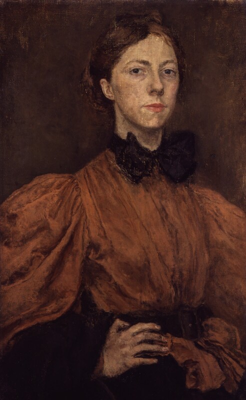
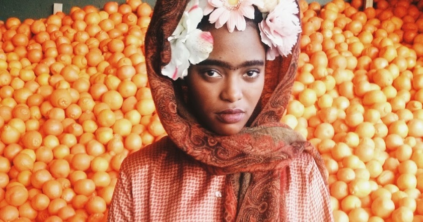
Reflection on Part Four and the Assignment

I think I paint with more awareness and zest than I draw. This probably reads like an odd introduction to the reflection on my experiences with drawing. In the beginning, I expected myself, to the contrary, to be good at drawing. The pleasure from that feeling when you touch a flat surface with the tip of a pencil, the infinite number of different marks one can leave on paper… And I enjoy having a look at other people’s doodles and more serious drawings on paper, it’s like a door to another person’s subconsciousness. Yet, I think I better unlock spontaneity and expression while painting. There is just more unpredictability there that excites me, the way paints can mix together is never boring. Therefore, all three works I made for Assignment Four are a hybrid of drawing and painting. I felt that my work would have been incomplete, would I leave it to the drawing medium alone.

This being said, I of course understand that drawing is the foundation of fine arts and I better master its technicalities to be able to grow in other areas. I do need to understand the rules of perspective, the ways to draw shadow and light and portray form and texture in a believable way. Understanding the mechanics of human body and its internal structures is important. I caught myself paying more attention to lines and forms that make up a human body. Sometimes, I can marvel at a small shadow under someone’s arm for a few long seconds. I must admit I sometimes stare at people in public transport, which makes even me feel uncomfortable. I wonder if other artists do the same.

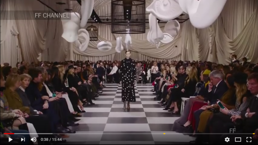
I’ve noticed that sometimes I feel more ‘in the flow’ when drawing than usual. The flow is often triggered by an external event, but not always. I’m a bit ashamed to admit that recently, I felt a strong force of inspiration when I was watching news about the recent Dior fashion show in Paris. I’ve never been into fashion that much, but I don’t exaggerate when I say that I felt tears coming to my eyes when I was watching the footage from the show. The new art director behind the brand Maria Grazia Chiuri has a very distinct artistic style. There is a fair dose of mysticism in her work, as well as dark humour and a rather quirky interpretation of the feminine. For instance, she introduced textile prints that feature tarot-inspired symbols with a feminist twist. They look mystic but also playful and rebellious at the same time.

Screenshot-2018-3-6 Christian Dior Haute Couture Spring Summer 2018 Full Show Exclusive - YouTube

I might have digressed a bit, so I’ll return to the topic of the essay, which is drawing of the human body and head.

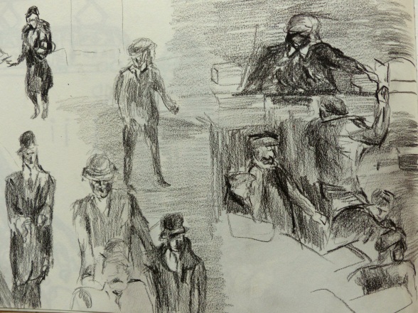
I’ve noticed I often get interesting marks when I draw quick. A couple of live drawing sessions I attended when I just started the chapter, were interesting as the model changed her position every 10 minutes or so. I had no choice but to draw very quickly, make provisional kind of marks, be satisfied with only basic shapes. And the results were not that bad… Perhaps because I got very little chance to overwork the drawings.. I think I sometimes overwork my drawing so that they look busy but in a flat and meaningless type of way. Besides, in those live drawing sessions, I enjoyed drawing curvy models with a relatively soft pencil (who doesn’t!?)

In my most recent drawing-paintings, but also in ‘pure’ drawings as well, I started treating negative space as ‘real’ space. So now it’s more ‘space’ and less ‘negative’ for me, if it makes sense. I try to apply varying shading to show areas of darkness and light in a more ambient way. Also, sometimes I make up the background and draw some patterns there, although they are just in my head. So, it becomes half-live drawing half-imaginative experience. I like it – it can sometimes affect the interpretation of my work (when I’m successful with my experiments of course).

Drawing figures in movement was a wonderful and transformative experience. Often, I drew with my eyes off the paper trying to memorise the elusive movement and body shapes. Drawing movement coincided with the period of intense fascination with contemporary dance. It led me to explore the work of local and international contemporary choreographers. It’s mesmerising how body can follow the music and assume sometimes ‘non-human like’ shapes. I think transcending your body and its physical limitation is at the core of dance. It probably feels special to be creative with nothing else but your body. Be lead by the music and feelings no matter the dark places it might lead you to. Would be interesting to explore it all further in my drawing-painting adventure.

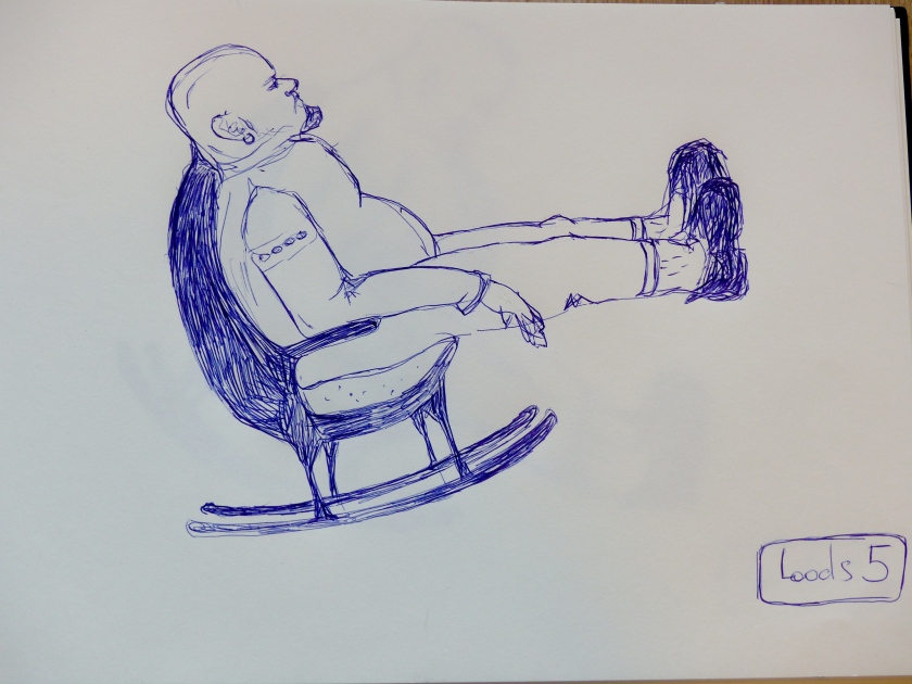
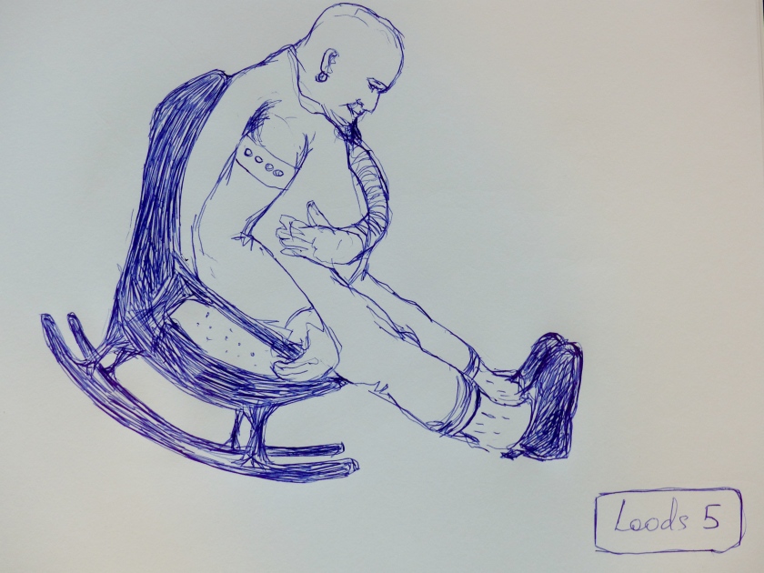
Drawing from memory was one of the most challenging and less satisfying experiences… What helped me most is remembering an emotion that I connected with the scene. For instance, what worked for me is drawing a serious-looking bold man with earing in his ear rocking in a chair. It worked because I connected an emotion (amazement) to it. How refreshing to see a serious-looking man giving his inner kid a free reign for a few moments. Manly and openly vulnerable – not often to be found in one person, in my experience at least. What didn’t work was trying to draw a model as if I’m at a live-drawing session. The drawing came out predictable and stale. I just cannot imagine the body that well yet.

Now a few paragraphs about the work that I’m submitting for this assignment.

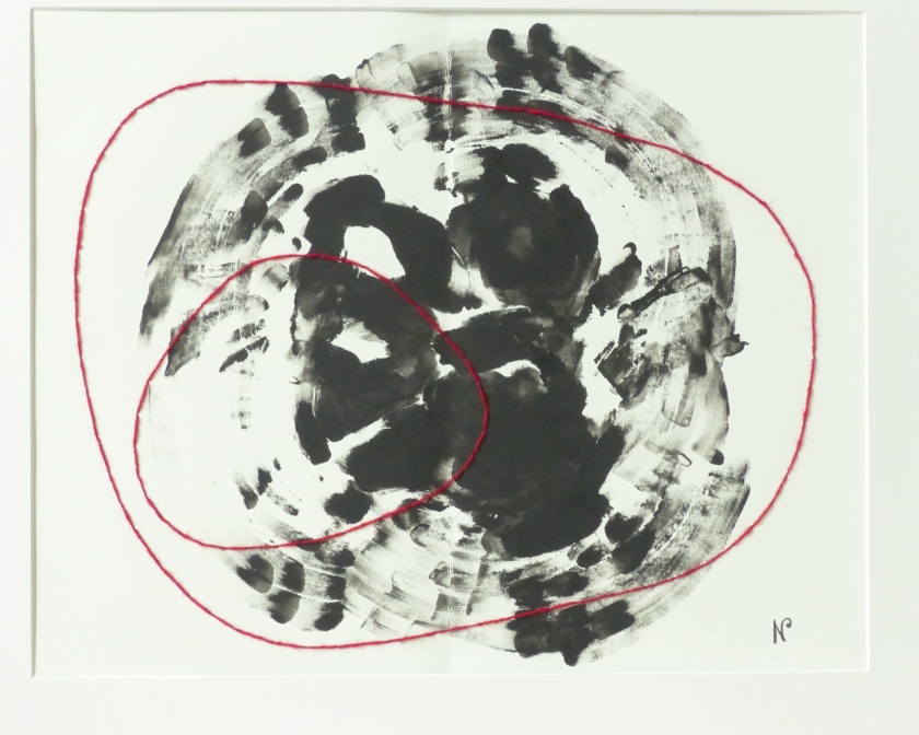
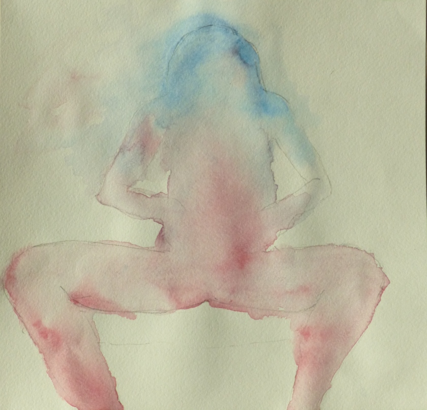
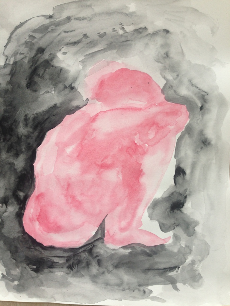
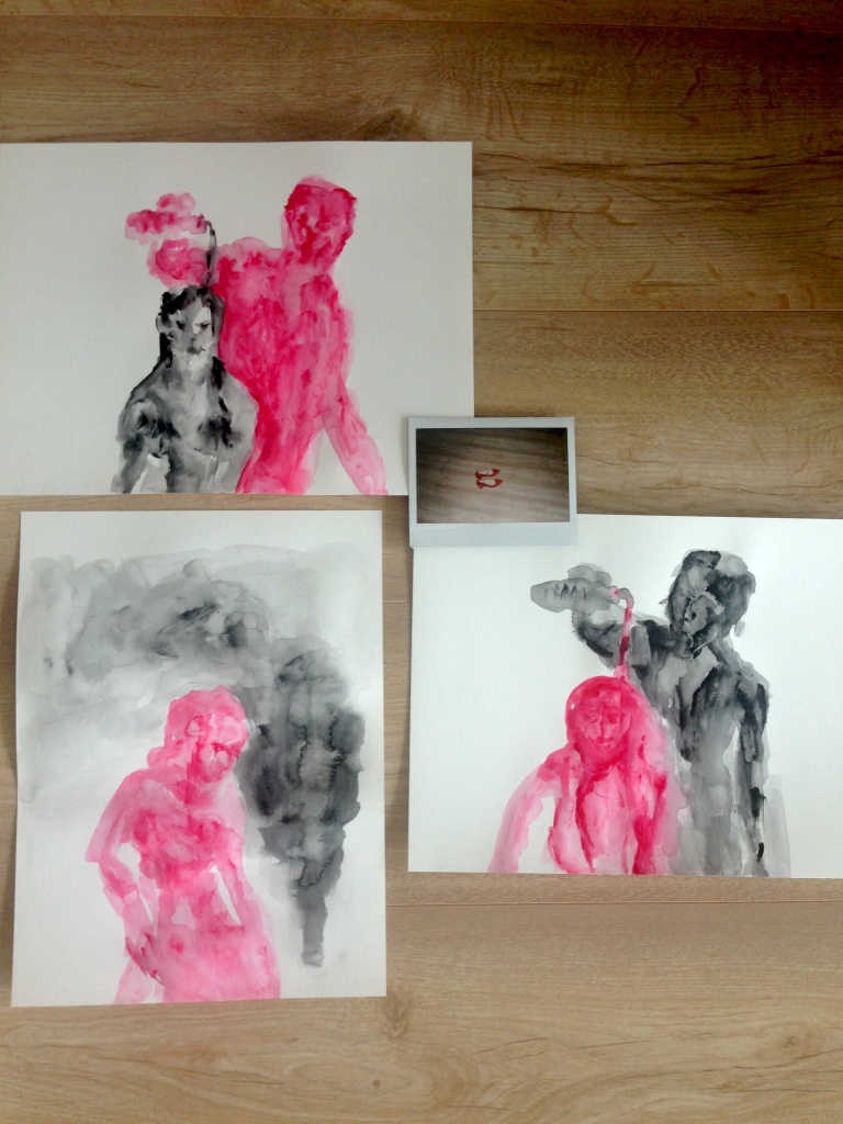
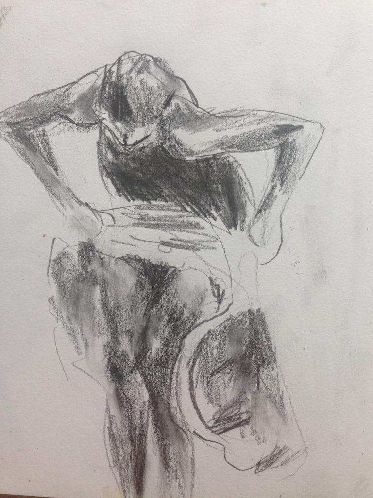
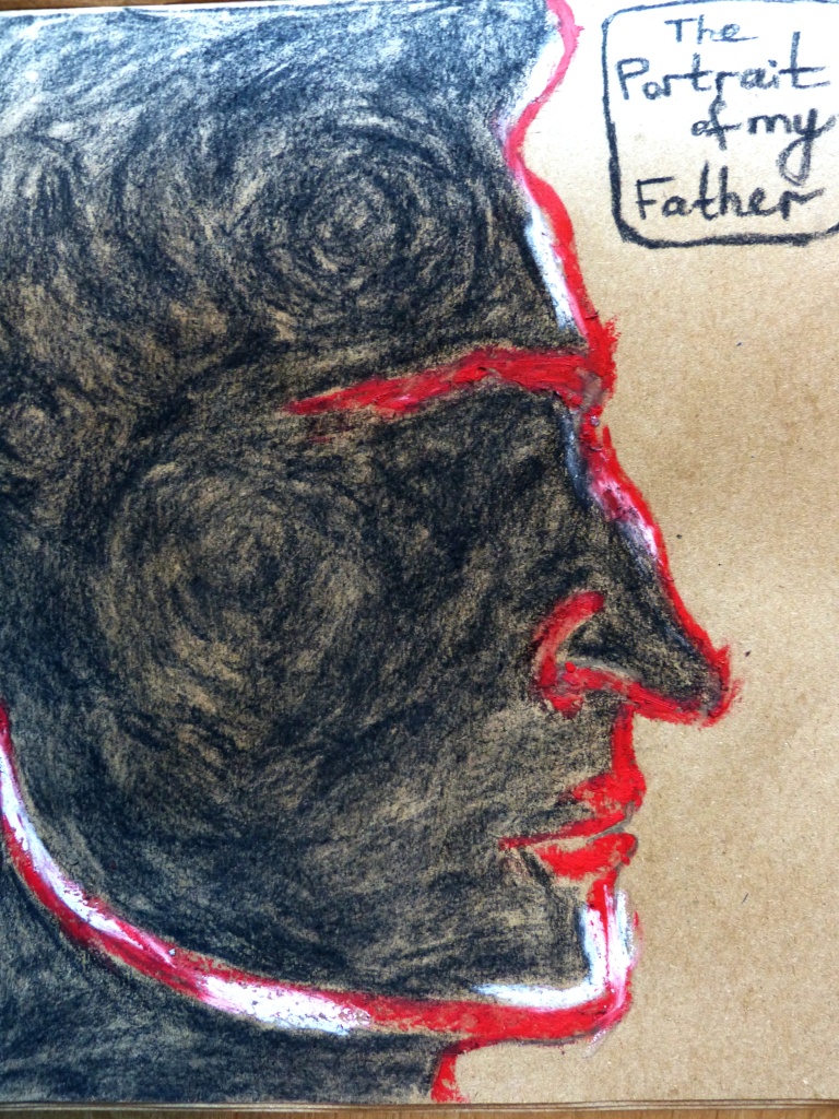
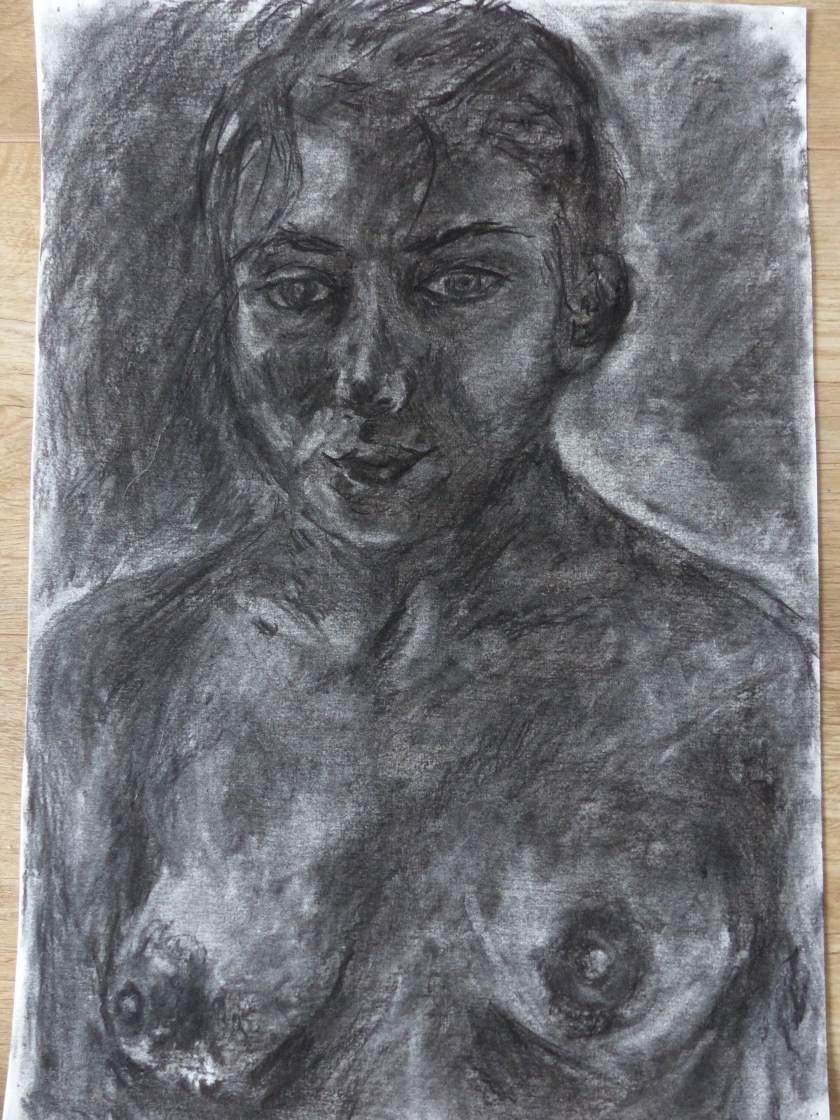
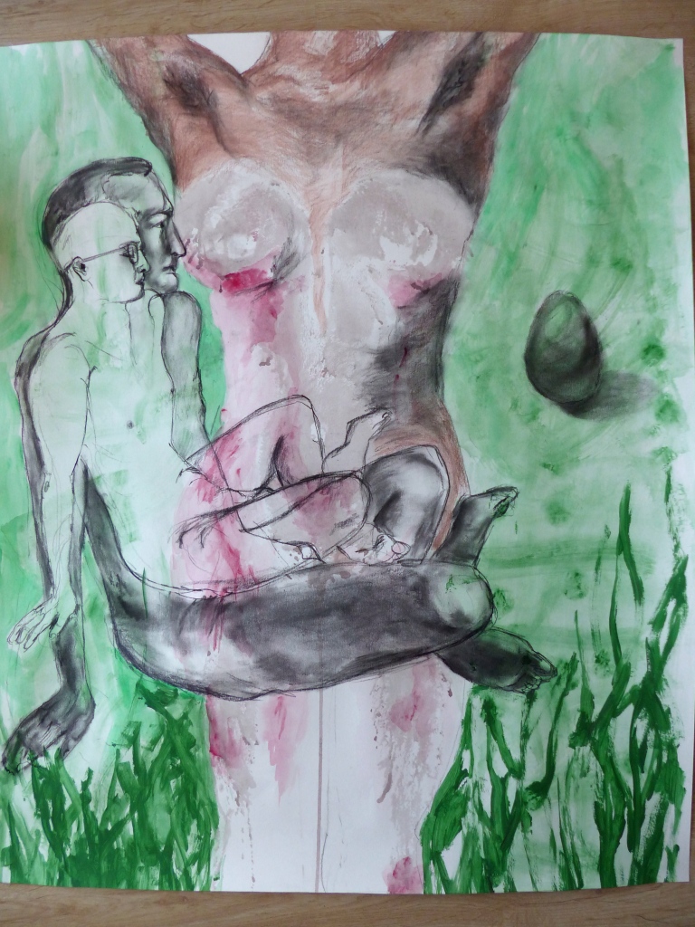
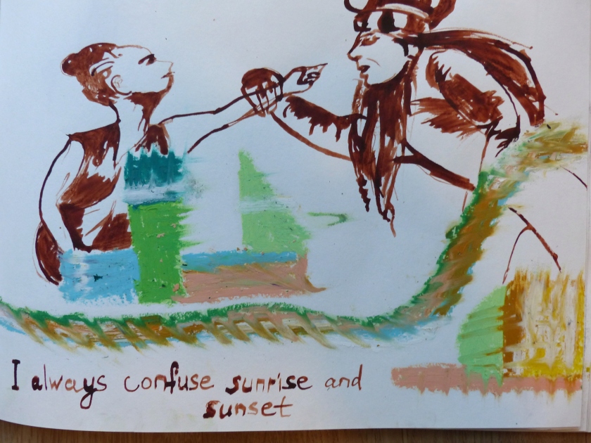
The first drawing represents a close intimate relationship. It can also represent the multi-layered nature of identity. The base image is my own body print – I covered the upper part of my body in a mixture of ink and red acrylic paint. I guess I wanted to leave my personal physical mark on the drawing, to try using my own body as a tool in my work. One could say that the body print represents me as a person, but also the female side in an intimate relationship. It happens to be the upper part of the body (without the head though) because that’s the part of the body that I feel is used rather often in popular culture as the epitome of the feminine. The value is often placed in parts of the female body that have to do with sexual desire and also reproduction. The drawing of an egg on the right hand-side is meant to represent fertility, but also expectation of society towards women. Then there are two more layers with drawings of a man in a meditating posture, one larger than the other. I made a few sketches of a sitting male model that I could choose from, but for the purpose of this work, I decided to go for the meditating one. I wanted to contrast the outstretched female body (a bit emotionally charged) with a calm and composed male body in a sitting position. On the auto-biographical side, it might represent my relationships with two main male figures in my life – my husband and my father. I haven’t thought about it consciously when making the work, but now that I’m analysing it, it makes a lot of sense.

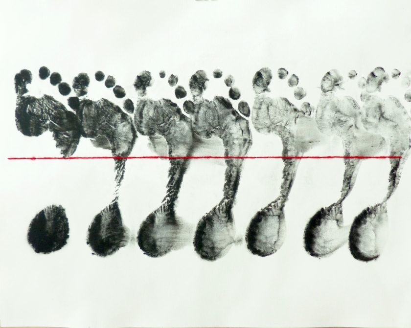
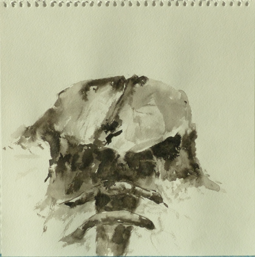
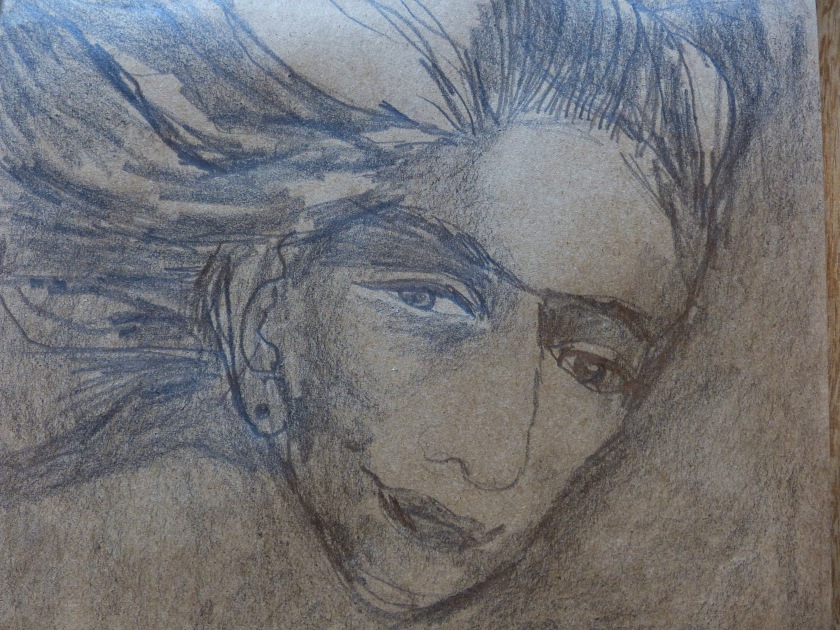
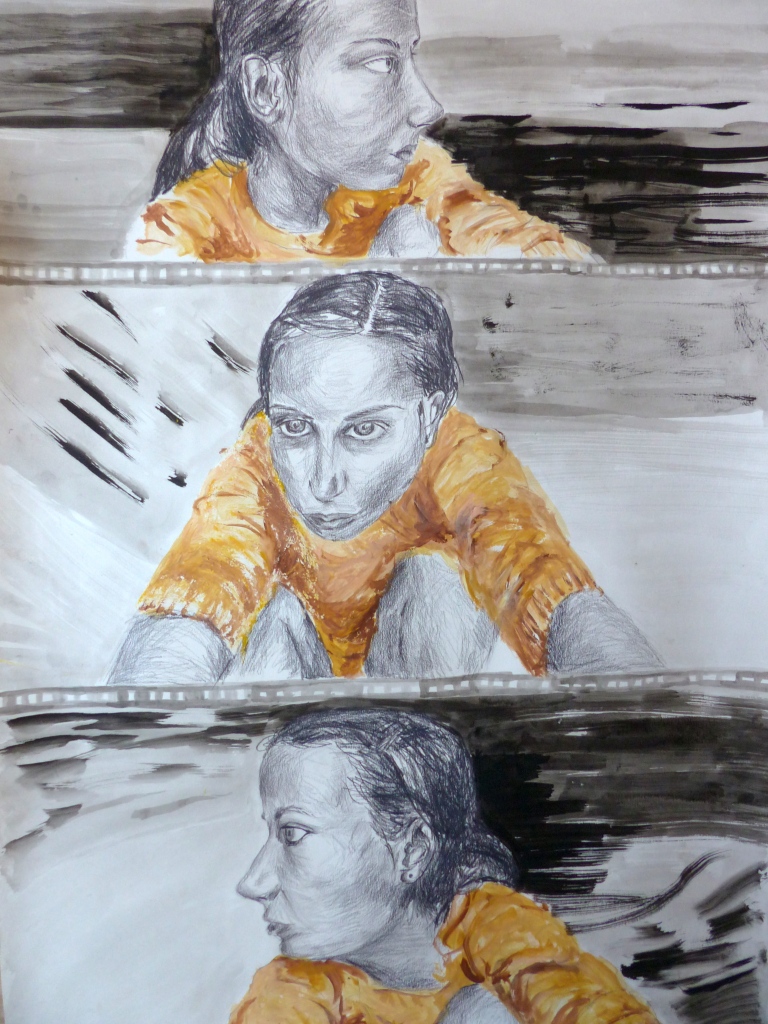
The second drawing is my self-portrait drawn in a kind of photographic or even cinematic style. Each image of the three represents a frame on the film. This work is about introspection – I look at myself from three sides (maybe I should have done four frames to show all four sides! The back ‘shot’ is currently missing). It’s also about self-criticism as the point of view I chose to look at myself from is not very flattering. I based the drawings on three selfies of myself, that’s the reason why I’m using ‘self’ and ‘looking at myself’ and not ‘they looking at me’. There is no valid reason really as to why I chose the colour scheme that I chose. I think my original idea was to make it black and white series of video stills but I later went for bright yellow colour as a way to make it more eye-catching. As a way of applying self-criticism to this particular work… I think it would have been more powerful to keep it black and white and execute it fully in ink. I guess I used pencil to draw the face(s) in my self-portrait mainly in order to exercise and demonstrate my cross-hatching technique. Also it would be interesting to emphasize more the ‘cinematic’ part. For instance, to draw stills of more continuous movement.

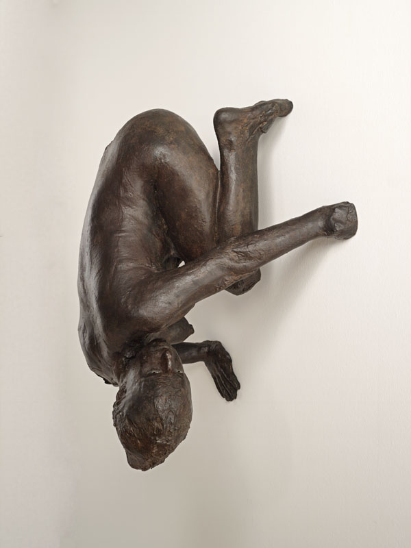
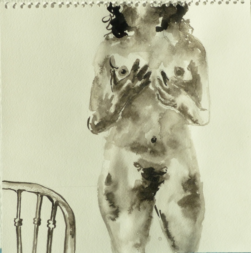
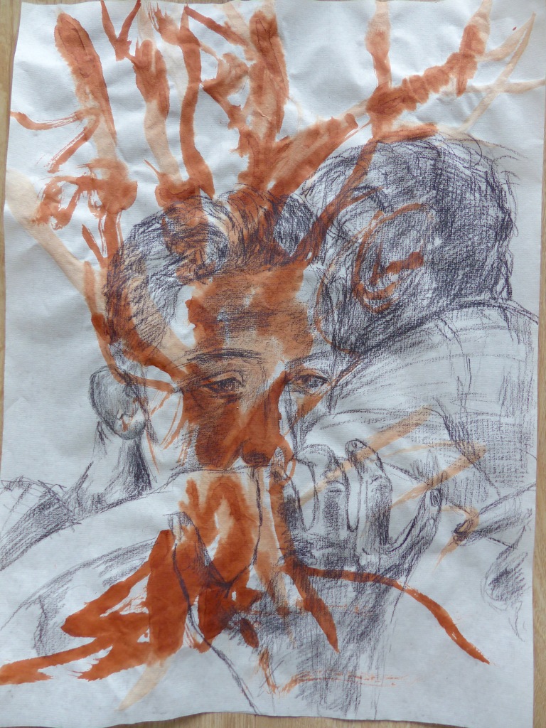
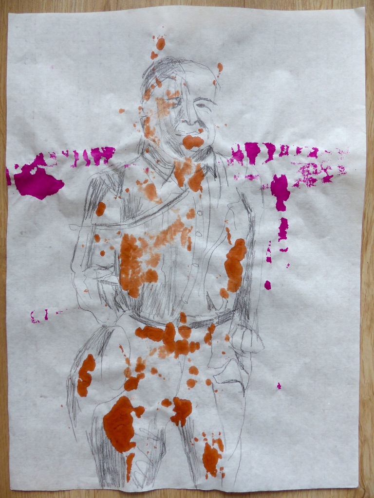
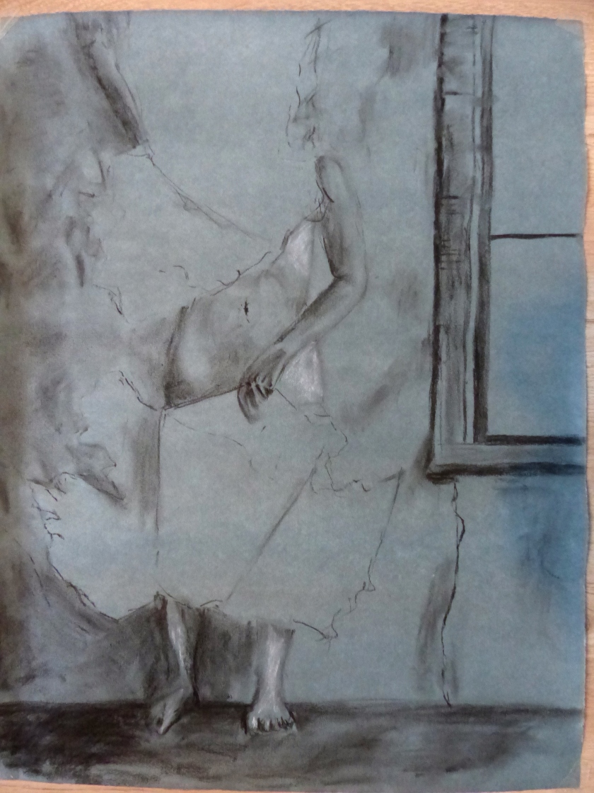
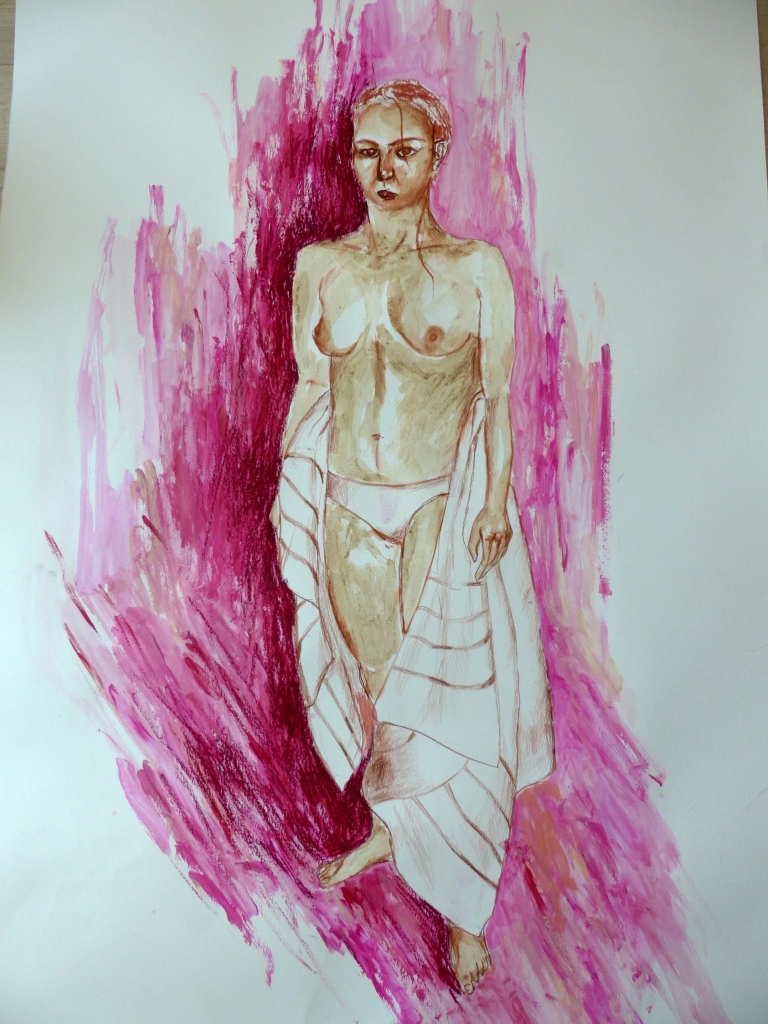
Finally, the third one, the image of a standing half-nude took me the longest to conceptualise but  it was the quickest one to draw. Not sure what it tells about the subject of my work or my preparatory research skills… To cut the long story short, first, I was trying to find a picture of a standing nude online, which proved to be very difficult. The search results were often skewed towards pornographic type of images that portray a woman more like an object rather than a person with agency. I searched for so long my eyes started hurting and I was feeling dizzy but I couldn’t find anything worthwhile. In the end, I asked my husband to take a picture of me after the shower. Even though a bit reluctantly, he agreed (it was rather late in the evening). The following day, I drew myself from the photograph. Another interesting fact is that I used coffee grinds to colour my body in the drawing. I’ve been experimenting with unorthodox drawing media lately, as it can add an interesting twist to the work. I like that coffee grinds give my drawing a very specific grainy texture and create a nice contrast to my style of marks. I think the resulting colour represent the colour of my skin rather accurately. It makes part of my identity, even though by ethnicity, I’m considered rather ‘white’.

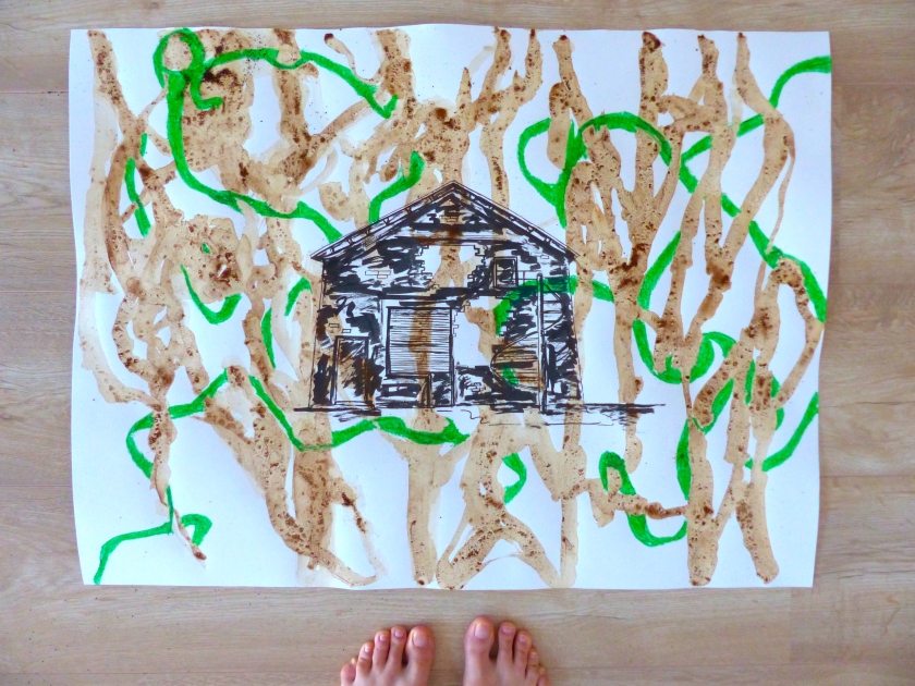
As to going forward, recently, I got a book of drawings by Nigel Peake titled ‘In the City’. I really liked how he deconstructed things that make up a city but often go completely unnoticed, like a system of pipes or grids in many different forms. To quote Peake, ‘the grid is adopted and changed in every city’.  I also found it interesting how he uses ink and watercolour for his architectural-like drawings – an unusual choice in my view. I mostly associate watercolours with romanticism and dreamy landscapes and his drawings look nothing like that.

I got an idea from his work to combine architectural (sometimes abstract) shapes with drawings of people – I did one provisional drawing to start exploring this topic. I’m thinking of maybe using this idea for the assignment in the final chapter of this course, which is about working on an independent project. I’m not sure yet.

P1100607

Another thing I’m contemplating for future independent work, is how to use text and drawing together. I don’t want to end up with an illustration to a piece of text, but rather create playful dissonance or harmony between images and words. I have some random ideas already – like writing down overheard phrases that piqued my interest or things I see on posters and other temporary and permanent surfaces around town.

All in all, it was an interesting chapter even though I’ve experienced periods when I temporarily lost interest in subject matter or slowed down my pace. I guess it’s part of my creative process. I’m really looking forward to the next chapter as it offers an opportunity to apply my skills to a longer project and make some in-depth investigation around it. The research and conceptualisation part really excites me as well as producing a body of work that would speak of me me as an artist at this specific point in time.

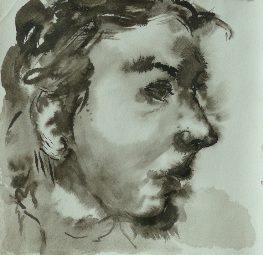
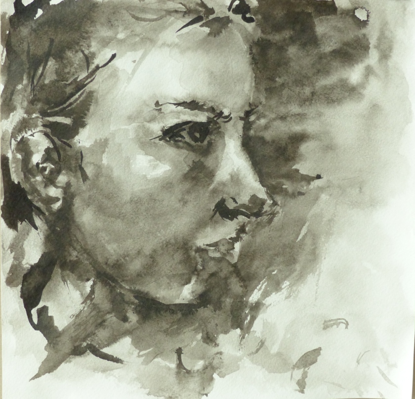
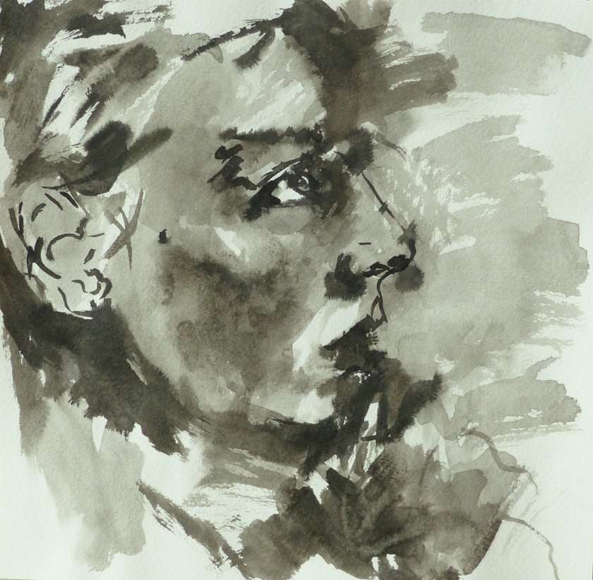
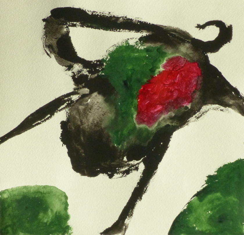
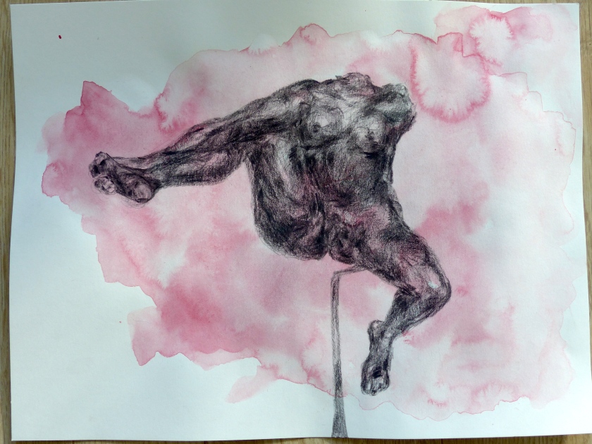
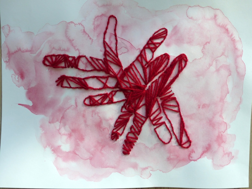
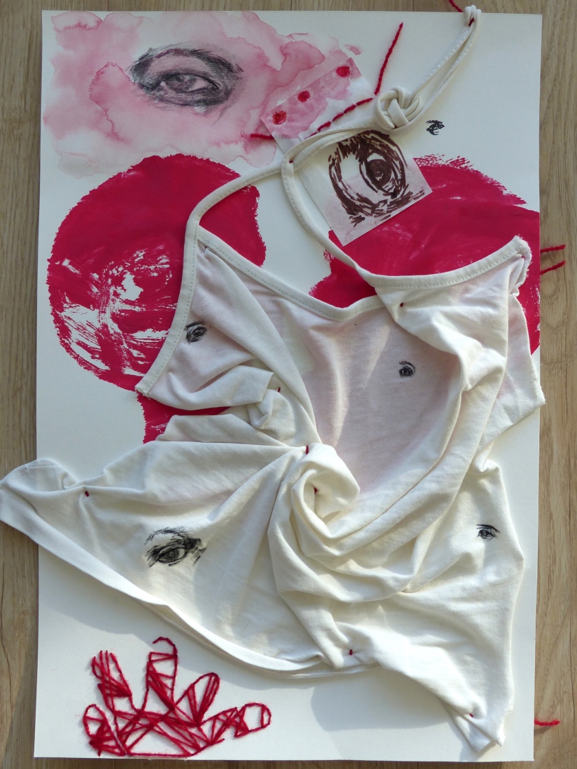
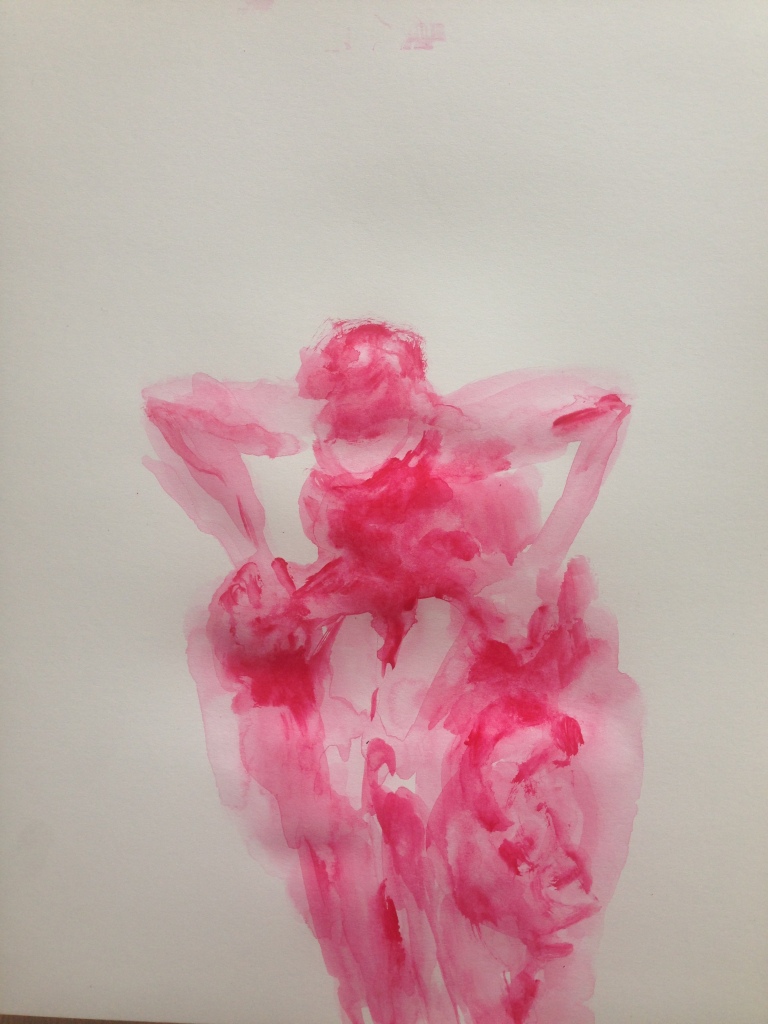
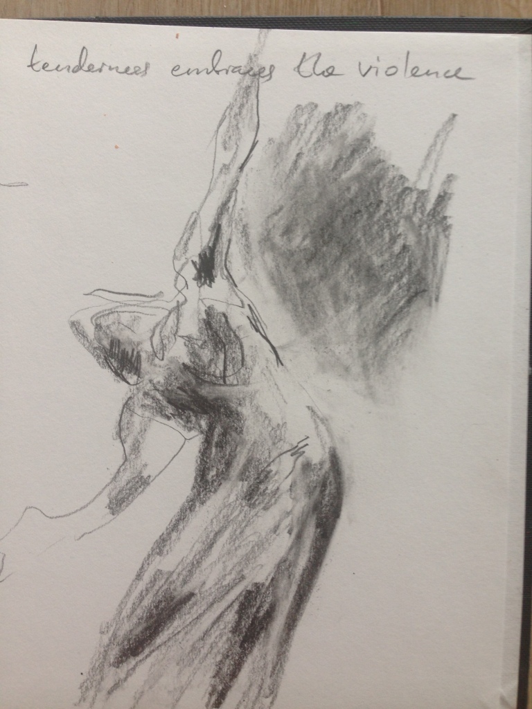
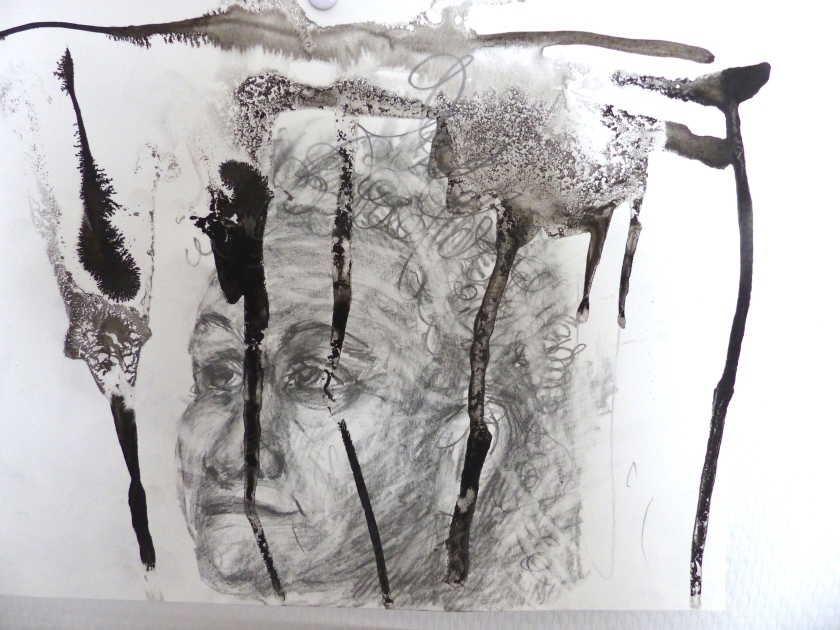
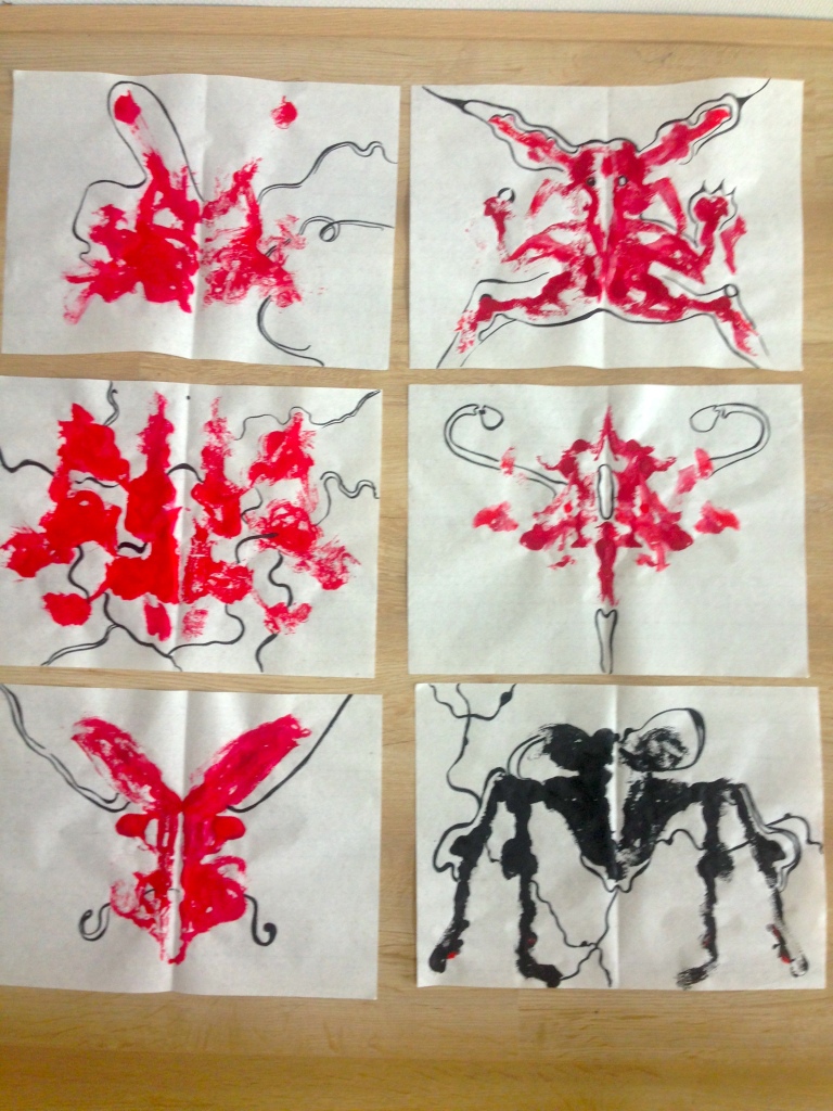
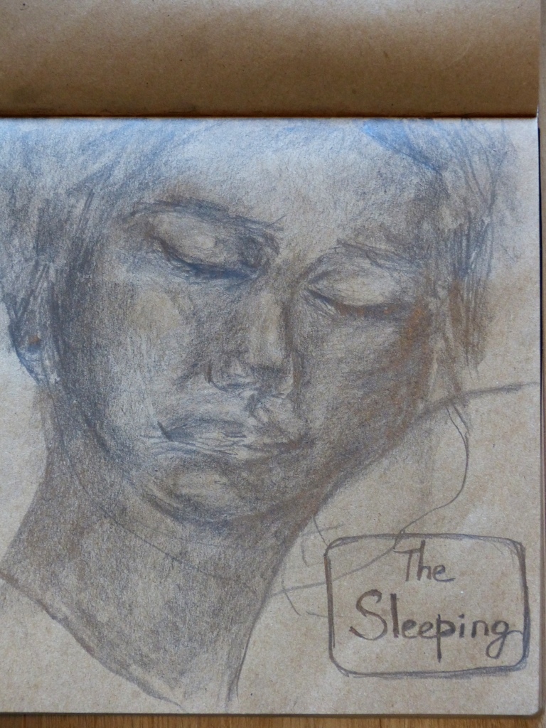
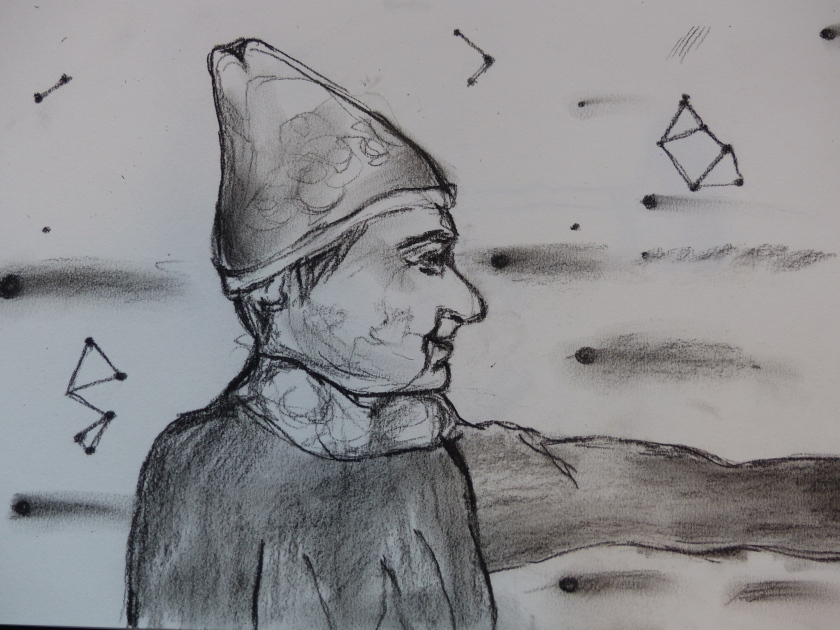
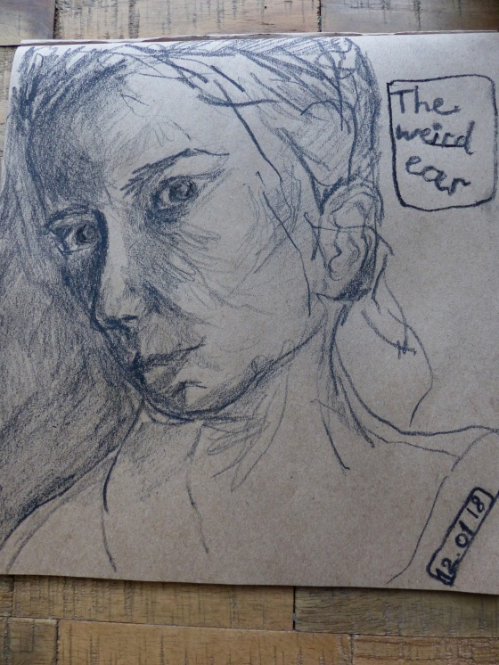
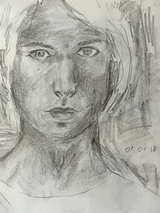
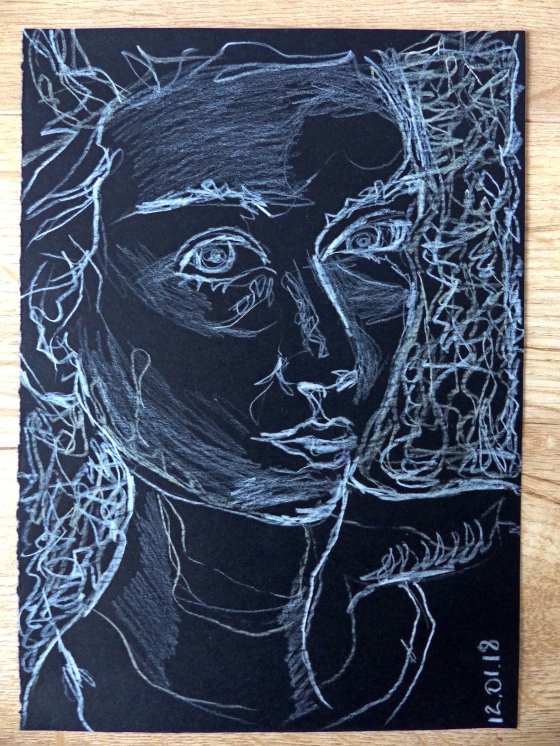
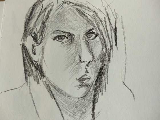
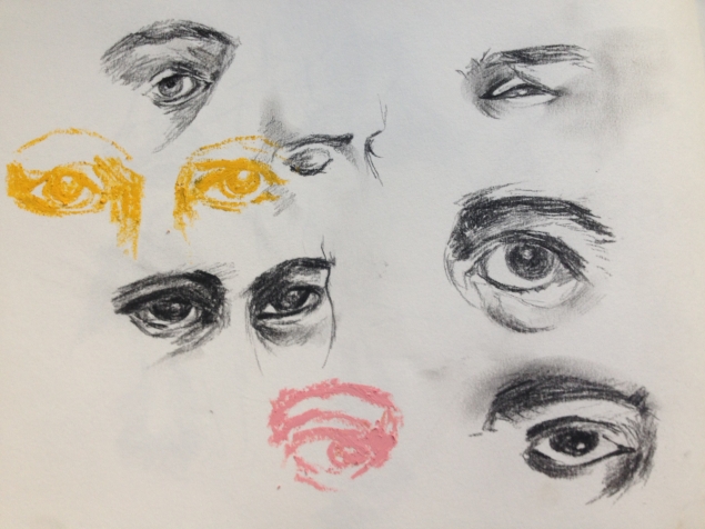
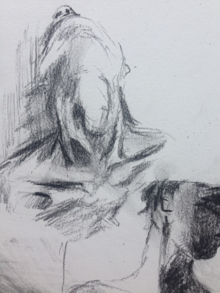
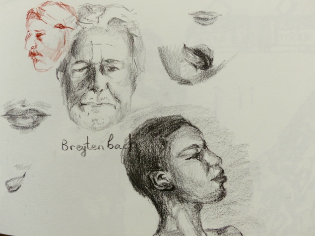
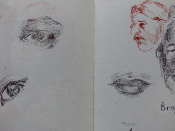
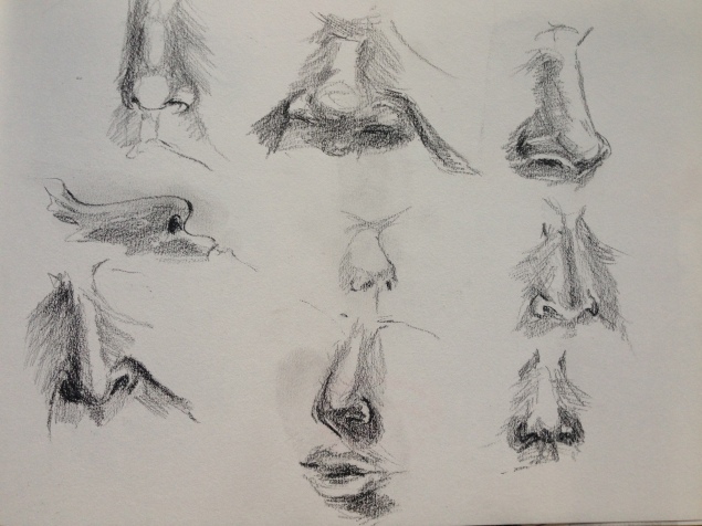
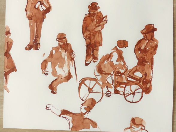
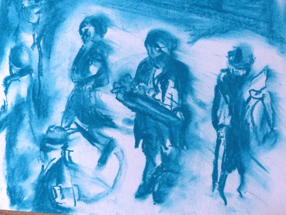
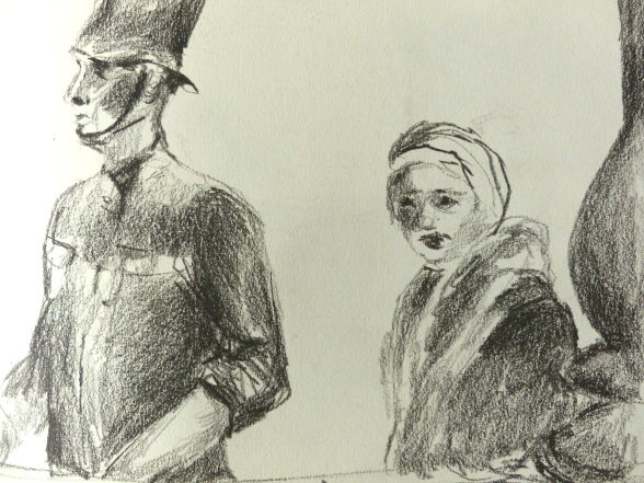
Preparatory pieces for the assignment:


Researching self portrait

Vulnerability

When I look at Rembrandt’s self-portraits, especially at those from the last decade of his life, I think about vulnerability. Not only did Rembrandt pioneer the art of self-inquiry and introspection, he also let himself be vulnerable with his audience. His self-portraits reveal the imperfections of old age with incredible clarity. The artist was painting his face in a way a diligent historian would describe an account of a battle – not a single little detail is left out, no redemption offered.

Rembrandt,_Self_Portrait_at_the_Age_of_63
Rembrandt, Self Portrait at the Age of 63. National Gallery. Image source: http://www.wikipedia.org

Rembrandt’s focus is almost always on his face, while the rest of the body is left in the shadow. At the time, the colour palette was probably considered quite innovative (read ‘unacceptable’). The textured surface of the skin reveals rough brushstrokes of green and red. This renders skin imperfect and far from flattering to the sitter. It’s so interesting to trace the movements of his brush when looking at the painting up close.

The self-portrait of the Welsh painter Gwen John (circa 1900) resembles stylistically Rembrandt but is far from showing any vulnerability. The artist looks confidently at the viewer with a mask-life face. It does not betray any feelings. Is it because that she, as a female artist, had to constantly prove herself to the art world as a worthy painter? You have to show toughness to be accepted as an equal in the ‘men’s world’.  Maybe I’m going too far with my analysis… The colour palette, the atmosphere and the tone of the painting seems otherwise close to the one used by Rembrandt in his late self-portraits. Is it a coincidence or was she indeed influenced by the Dutch master?

mw03484
Gwen John
by Gwendolen Mary (‘Gwen’) John
oil on canvas, circa 1900. National Portrait Gallery. Image source: http://www.npg.org.uk


Constructing identity

I cannot not mention Frida Kahlo when writing about self-portraiture. Her use of symbolic objects and emotionally-charged spaces leaves a lasting impression. I would dare to argue that imaginary scenery and external objects she brings in to construct her identity are at the center-point of her self-portraits and not, as it is conventional in self-portraiture, the artist’s body. Her body is deceptively present in her paintings while her mind seems to be wondering somewhere else.  As it was written in the article by Google Arts and Culture, Frida Kahlo, in a way, constructed her identity through disability. Quite a few of the objects seen in her self-portraits are related to that.  However, it might also be that critics read too much of her personal life into her work. By definition, self-portrait is a very personal exploration, but story-telling is almost as important, I believe.

And, finally, just recently, I came across photographic work of a South-African artist known as Tony Gum. She uses Kahlo’s imagery and applies it to her local context using objects symbolic to South African way of life. I haven’t decided yet what to think about her work, at least she doesn’t appropriate iconic imagery thoughtlessly.  There is also something else – it definitely helped her to make a name for herself outside of South-Africa…

tony gum as frida kahlo
Image source: tonygum.blogspot.com

Portrait from changing memory

The portrait of my father. This is a very emotional drawing for me and comes out of my reflection about the relationship I have with my father. The profile is dark because I think I know very little about my father, even though we spent a considerable amount of time together. The little swirls of colour inside the red outline indicate unresolved emotional tensions and conflicts. The outline looks menacing thanks to the red oil pastels almost burning the paper with their intensity.

P1100520

The head hovering in the air started off as a drawing of a character from the novel I’m currently reading. The fictional character I had in mind was a lady from the 19th century gentry, who was known for her beauty and vanity. While drawing, to my surprise, a unibrow manifested itself on the woman’s face. It changed the direction of my drawing, and quite radically so. I switched to a fairy tale-like character of a powerful and unordinary woman from the South Asia. She has a magical ability to hover high up in the air and see what ordinary folks are doing down on the ground.

P1100522

The act of sleeping is a drawing of a black woman resting on a pillow. At the time when I did this drawing I was preoccupied with my sleeping habits. I’m a light sleeper, so a relatively light noise from the outside can wake me up. This made me somewhat obsessed with getting the right amounts of sleep every day. Drawing a woman who seems to be at peace and relaxed while asleep made me feel good.

P1100525

The elderly guy looking a bit like a wizard is a drawing of a real person, for a change. I saw this elderly man on a ferry on my commute to work. He had a very remarkable profile, which I didn’t manage to capture accurately. He was wearing a funny hat which made him look a bit like a wizard. This comet-like objects flying towards him, which he tries to stop with his left hand is, probably, my feeling of being attacked at work that day.

P1100516

And finally, the double drawing of a bold guy swinging in an armchair. It’s based on a scene I witnessed in a furniture store this weekend.  It struck me with its playfulness that you won’t usually see in a grown-up man.

P1100511

P1100515

3 Figure drawings

Prior to this exercise, I spent some time researching photographic works by Francesca Woodman. Her gothic self-portraits made a huge impression on me, so I decided to make a few drawings based on her photographs. I used dark paper to convey the mysterious and moody atmosphere so charachteristic to her work. Drawing with dark soft pencil on dark grey-blue paper created a troublesome in-between feeling. It’s neither day nor night, and the person portrayed seems to occupy an in-between state. I really liked this story-telling element in the drawing process.

However, it’s not always a very rewarding experiencing to make a drawing based on a photograph. The result doesn’t come even close to the photograph in terms of emotional impact and reproduction of reality. Also, the bright highlights in the second drawing with a lying half-nude don’t look very good. They are either in the wrong places or not needed at all.

P1100506P1100508

I created the third drawing of a seated man in a hat at a drawing workshop. One of the biggest classical art museums in the Netherlands Rijksmuseum organises live drawing workshops, which I sometimes (very rarely) attend. I quite like them because I get a chance to do some live drawing and explore new media and techniques. For this drawing, for example, I covered almost the entire surface of the paper with charcoal and then started working with a rubber to ‘carve out’ forms and shapes. It’s almost like creating a sculpture, but without the 3D effect of course. I like this technique as it helps me produce interesting new marks.

I’m not very happy with the shading in the drawing – in some areas it’s way too crude. I should have used softer lines when shading, otherwise, the dark areas draw too much unneccesary attention to themselves.

P1100510

Drawing the self

Response to Exercise 2 in Project 6 ‘The Head’

It’s interesting almost from the psychological point of view why my self-portraits look so different from each other. They are supposed to have something in common, aren’t they? Drawn at different times of the day, I look at myself in different emotional states from grumpy to thoughtful and dreamy.

I used a soft pencil for all the five sketches below. The common theme – Christmas time and spending time with family…

Examining the line and shading in my drawings now, I wish I was focusing more on blocks of light and shadow, rather than on the line. However, I love focusing on the line…

P1100471P1100496P1100485P1100494

P1100486

Face & Character

The variety of facial features is fascinating. When I just started drawing I often defaulted to the learned set of facial features and expressions that I mastered well. Now that I observe people with more attention and interest, the diversity finally starts to reveal itself.

I also try and inquire into the character of a person while drawing him or her. It’s of course too simplistic to think that one can understand something about a person from his or her portrait. It’s very tempting though. Perhaps this simplistic assumption can be challenged and turned on its head? It would help to reveal a tension between someone’s looks and identity. That’s not for now though.

IMG_5929

IMG_5828P1100491P1100493IMG_5932

Group of moving figures

These sketches are based on stills from historical videos of urban life. I was watching a very old footage of people going to work in London in the 30s of the last century, when I decided to pause the video and snatch a random moment out of continuous history. The result looked promising! The difference in clothes and movement and even facial expressions surprised me more than I thought it would. People going to work were captured while on their routine commute, yet this routine became a historical moment for future generations watching this video in the 21st century. How amazing. Perhaps our own routines will become someone else’s finding in the future?

I made the first sketch in brown ink, the fluidity of ink speaking to the fleeting nature of the captured moment.

P1100473

The second sketch was made in pastels. Perhaps the colour choice is not great as it doesn’t reflect the archival quality of the video well enough. Yet I liked the mutability of chalk pastels and their fragility. You can erase the whole scene or a person with a finger.

P1100474

And, finally, the third and forth drawings were made in a very soft black pencil. Perhaps the medium closest to correctly representing the black and white archival video. However, it’s the least favourite of my drawings. There is something irreversibly finite about these images, while the other ones look more provisional and I like it more.

P1100488

P1100490